
The Taupe Trend in Interior Design
This article is also available in French: La Tendance du Taupe en Décoration
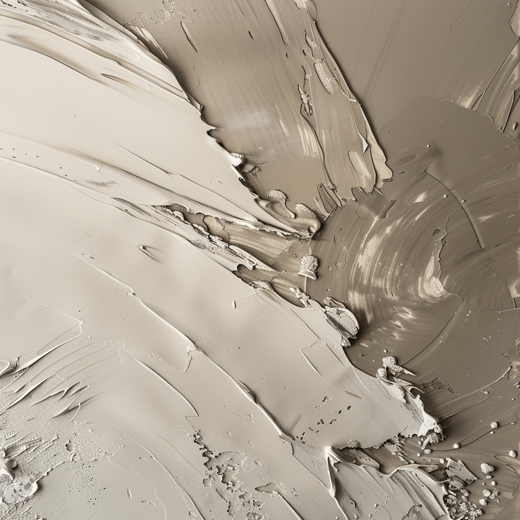
Taupe remains an essential color in interior design; it is timeless and highly appreciated. Its muted, soothing tone adapts to a multitude of colors and decorating styles. However, because it absorbs light, poor lighting can detract from its elegance and subtlety. As it is a complex color, here are some tips for optimal lighting with taupe walls.
Taupe: taupe inspiration

Does the color taupe get its name from the small underground creature of the same name? Yes and no. While some moles have earthy fur, ranging from gray to brown, others are darker, even black, with hints of blue. This diversity highlights the complexity of the color. However, the name "taupe" is attributed to this shade due to its similarity to the mole's coat. Combining gray mineral tones and brown vegetal tones, taupe offers a varied palette, making it adaptable to various interior design situations.
Taupe: a delicate fusion of hues

The color taupe is a warm fusion of two opposing shades: brown and gray. Their combination produces the neutral and subtle hue that is taupe. Some perceive it as gray, others as brown, illustrating the infinite diversity of its shades. This color is complex and sophisticated, with a varied range of tones, from rose to putty, including gray and sand. These nuances can vary in intensity, but it is difficult to categorize them as light or dark. Depending on the chosen shade of taupe, the decorative and luminous effect on walls can be quite different. It is this diversity that gives taupe its "chameleon" character, allowing it to adapt to all kinds of decoration projects, styles, and rooms.
The best color combinations with taupe

Taupe is highly prized in decoration for its versatility and timeless character, which has made it a popular color for many years. Its use involves little risk, making it a safe choice. It is particularly appreciated for creating natural, refined, and warm atmospheres.
In styles such as Flemish, Shabby Chic, or Gustavian, taupe adds a touch of charm, depending on the chosen nuances. For authentic and comfortable decors, it blends harmoniously with neutral tones like light to dark grays, off-whites, blacks, linen or twine shades, as well as rosy hues such as rosewood and powder pink. These combinations reinforce the warm and welcoming atmosphere of taupe.
In contemporary, Zen, or ultra-design environments, taupe leans more toward gray than brown and combines perfectly with bright whites, charcoal grays, and blues with a touch of black, such as storm gray or glacier. For those seeking bolder combinations, taupe can be paired with bright colors such as madder red, traffic orange, lime green, and even petrol blue, creating a contemporary and dynamic effect. In short, taupe offers great freedom of combination thanks to its flexibility and varied shades.
Taupe on walls or as a total decor look?
Taupe, a neutral and discreet color, lends itself perfectly to a total look, especially on large surfaces, without the risk of monotony. Walls are therefore an excellent canvas for this elegant shade, which offers more subtlety than gray. It is easy to imagine applying taupe to entire wall sections, in matte or satin finishes, whether in the living room or the master bedroom. In an entryway, the full application of taupe creates a warm and intimate cocoon, accentuated by small accent lamps, thus offering a friendly welcome to visitors. Its neutrality also makes it a popular choice for a guest room or a multipurpose office. Furthermore, taupe is just as appealing in children's rooms, for both girls and boys, with a trendy combination of taupe and gray for their space.
The natural sobriety and moderate hue of taupe also make it the ideal color for decorative effect paints. Finishes, whether simple or complex, harmonize better with taupe than with other colors. Iridescent, limewashed, whitewashed, crackled, sanded, sponged, or concrete-effect walls pair perfectly with taupe, as well-chosen lighting helps highlight the play of light and shadow of this color.
The color taupe on floors: light!
The color taupe is also very popular for floors, whether in the shades of contemporary polished concrete or in the more traditional tones of Tadelakt revisited with an ethnic touch. The satin and smooth finishes of these floorings give taupe a beautiful luminosity. A bathroom covered in taupe Tadelakt instantly becomes a space of relaxation and comfort! Taupe also softens the cold appearance of tiles, shifting them toward more textured and comfortable finishes like leather; it also offers beautiful uniformity to a PVC floor, giving it a warmer and more lively atmosphere. Accent lamp lighting highlights the taupe color applied to the floor: they illuminate the corners of the room with a pleasant warm hue, adding relief to a large open space. By opting for a total look, taupe adopts a contemporary aesthetic; used in touches or on furniture, it creates a more classic and authentic atmosphere.
Natural light or privacy for the color taupe

The color taupe, by its nature, absorbs light rather than reflecting it. To highlight it, there are two possible approaches: harness natural light to reveal its nuances and play with reflections, or use its discretion to create an intimate atmosphere and emphasize architectural details.
By harnessing natural light, the color taupe can reveal all its richness and velvetiness. In a room with white walls, for example, it is better to paint the walls adjacent to the windows in taupe, thus avoiding absorbing too much brightness. Natural light then reflects off the white walls, creating a subtle play of nuances that brings charm and brightness to the room.
On the other hand, taupe can be used to create an intimate atmosphere and highlight architectural elements. In a north-facing bedroom, for example, walls painted in taupe, especially the one behind the headboard, can transform the lack of light into a decorative advantage. Similarly, in a living room, taupe-colored frames around a bookcase, a niche, or an alcove add depth and relief to the space.
Choosing the right artificial lighting for the color taupe
Artificial lighting can alter the perception of colors, and taupe is particularly sensitive to this. The color can therefore appear very different depending on the lighting used. If the artificial lighting is inadequate, taupe can lose its warm appearance and become dull, or even take on a greenish tint, which moves away from the desired effect. In this case, taupe walls can give the room a cold and dark ambiance, far from the sought-after atmosphere. In order to preserve the natural aspect of taupe, it is essential to choose lighting that faithfully reproduces the solar spectrum, thus ensuring the maintenance of the warm and welcoming atmosphere of the taupe color.
In stock · shipping costs shown at checkout · up to 30% off in your cart


Ready to turn inspiration into reality?
Tell us about your room, your style and your budget, and we will show you the pieces that truly suit your project.
Get guidance in 30 seconds →


