
Paint color for a bright living room: how to choose well
This article is also available in French: Couleur de peinture pour un salon lumineux : bien choisir
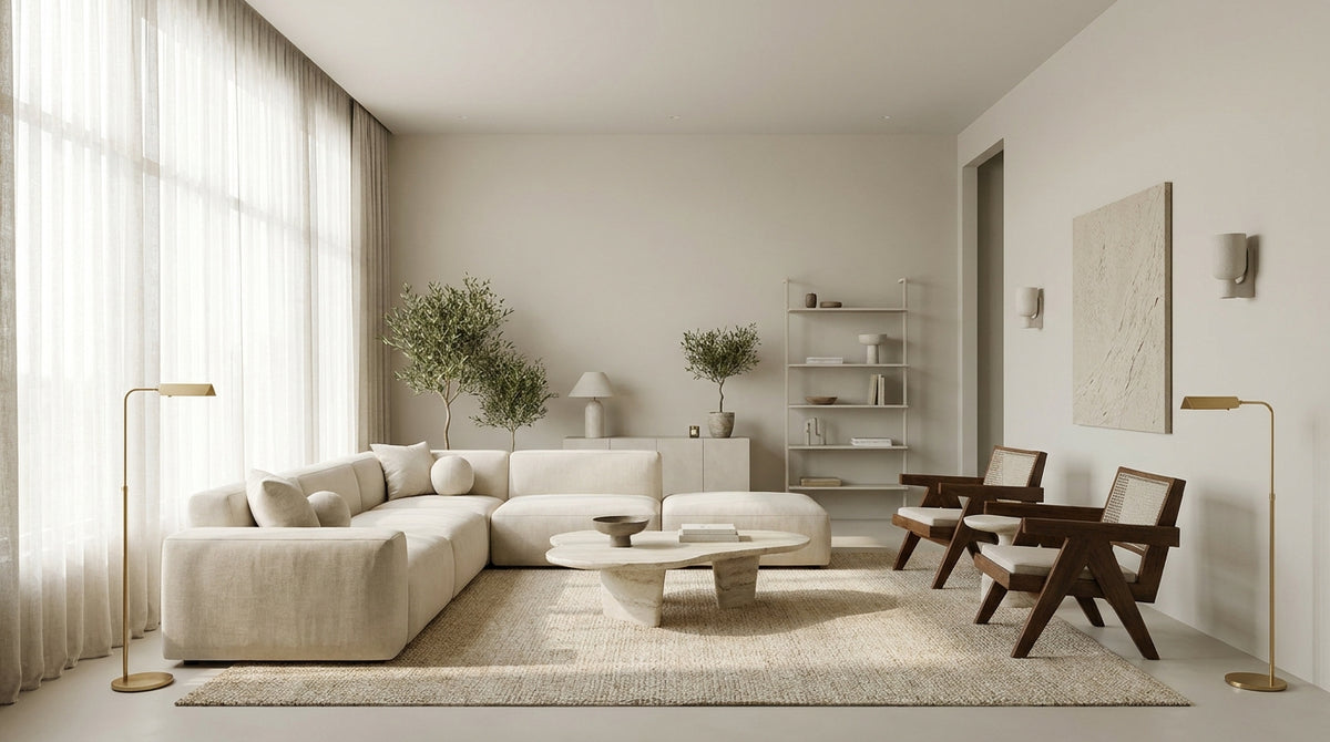
A room flooded with light can quickly seem cold, washed out, or dull if the wall color is poorly chosen. The right color depends less on trends than on the actual light in your room and its orientation.
Even before thinking about the walls, a living room's atmosphere is also built with its lighting: a beautiful light shade only truly reveals itself under a good living room light fixture. Here is the method to find the right shade, and then how to style it properly.
What dominant shade do you envision for your bright living room?
What color to choose for a bright living room?
For a bright living room, opt for a light shade with a neutral undertone: off-white, beige, greige, or pearl gray. These colors reflect natural light without being blinding, make the space feel larger, and maintain a soft ambiance from morning to night. Then, adjust the exact value based on the room's orientation.
Two benchmarks matter before the color itself: the value (the degree of lightness) and the undertone (the hidden nuance, warm or cool). The same light shade can lean toward yellow, pink, or green once applied.
The fail-proof test: paint a sample on two different walls, then observe it in the morning and at the end of the day. Light changes everything, and a perfect white at noon can turn into a dull gray at dusk.
Why opt for light paint in a living room?
Light paint in a living room multiplies the sense of space and diffuses daylight instead of absorbing it. A light paint color is also easier to live with: it serves as a neutral backdrop for your furniture, textiles, and decorative objects without overwhelming them.
It is the ideal foundation for combining colors in a living area without making mistakes. The light wall establishes calm; strong accents come later, in small touches.
Which beige color palette for a bright living room?
A beige color palette for a bright living room comes in four families: linen, soft and slightly grayish; sand, warm and sunny; greige, between gray and beige, very versatile; and off-white, almost neutral. Choose according to the warmth you want to bring to the room.
Beige is not a flat shade. Linen soothes a very sunny room without cooling it down, while sand warms up a somewhat neutral living room. Greige, for its part, goes with almost everything, from light wood to black metal.
If you love these natural tones, the ecru color in your home opens up other paths that are just as bright, midway between white and beige.
How to adapt the color to the room's orientation?
Adapt the color to the light the room receives. A north-facing living room with cool light benefits from light shades with warm undertones (sand, linen, cream white). A south-facing living room, which is very bright, can handle more neutral whites and pearl grays that temper the excess heat.
In the east, the morning light is bright then fades: a soft beige remains stable throughout the day. In the west, the warm tones of late afternoon harmonize with a greige or off-white. Also consider the ceiling, which is often forgotten: when treated correctly, it reflects light downward and makes the room feel airier, as shown by the choice of ceiling color.
As for shades to avoid: grays that are too cold and bluish, which harden a north-facing living room, and highly saturated whites, which cause glare in the south. To combine safely, stay within the same family of undertones. A good light gray can thus pair with a warm beige, provided they both share the same temperature.
Are you still hesitating between two light shades or don't know which fixtures will go with them? Take a minute to chat with our decor advisors, who can guide you toward the right color and lighting for your living room.
How to enhance your color with the right lighting?
Enhance your color by caring for artificial light just as much as the paint. A light shade gains all its depth under warm-temperature lighting (around 2700K), distributed among several sources: a central pendant, a floor lamp, and wall sconces. It is this interplay of lights that gives relief to a light wall once night falls.
In a living room with pale walls, white and light fixtures blend into the decor and diffuse soft light without breaking the harmony. Conversely, a black or gold pendant creates a graphic contrast that structures the room.
Vary heights and intensities: a dimmer allows you to switch from work lighting to a dimmed atmosphere in the evening. To continue the color reflection, take a look at the wall shades of the moment, which also inspire the choice of fixtures.
In stock · shipping costs shown at checkout · up to 30% off in your cart


Ready to turn inspiration into reality?
Tell us about your room, your style and your budget, and we will show you the pieces that truly suit your project.
Get guidance in 30 seconds →


